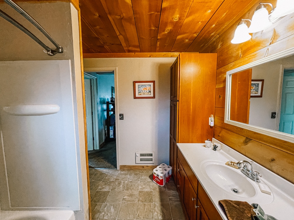
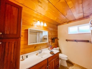
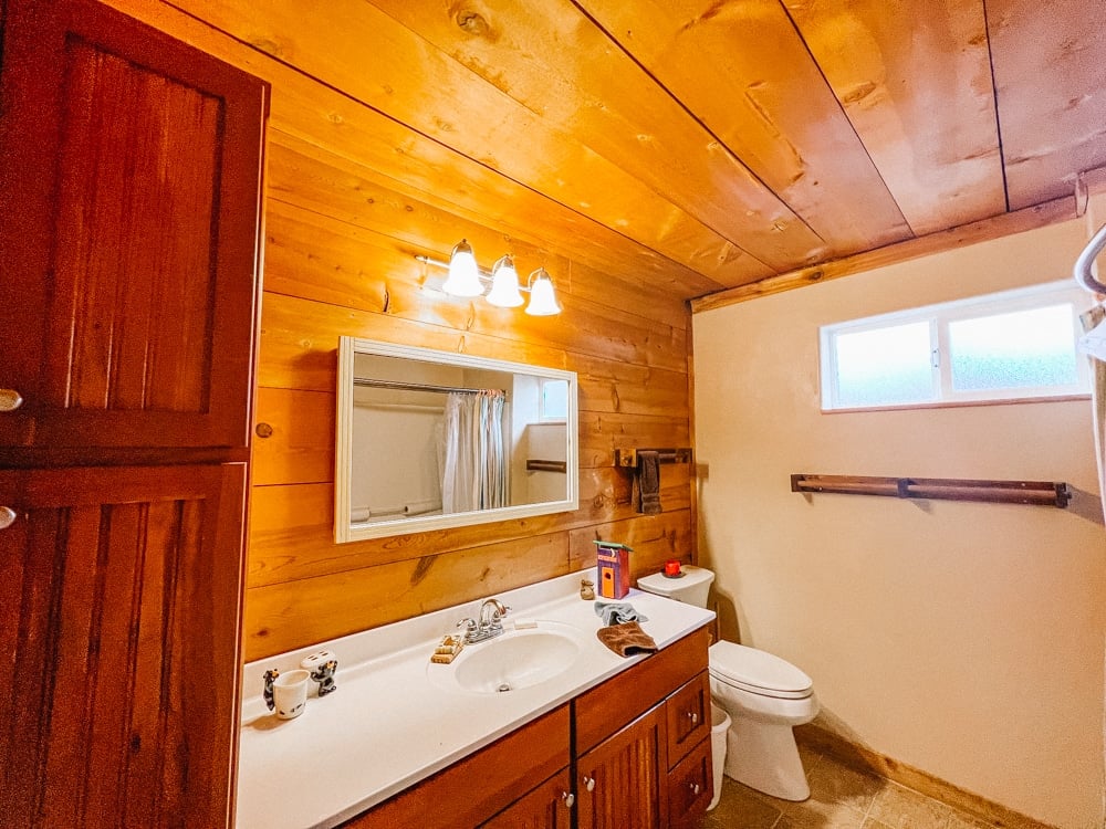
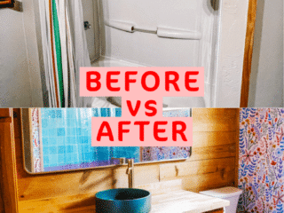
When I toured our Whimsy Homes cabin bathroom the first time, I saw past the leaky shower liner and odd yellow mirror. I saw so much potential to build a fun room that oozes joy.
Hey, bathrooms are the perfect place to go a little wild in my opinion. Here’s everything we did to our cabin bathroom makeover!!
The main bathroom is the first room we’ve completed fully in this renovation (well, almost. I still need to swap out the toilet paper holder for a gold one but that’s in the mail right now!)
First, here’s all the good stuff we put into the room, and then below I’ll spill all the juicy gossip on the failed projects, why we did design choices and tips for renovating a bathroom yourself!
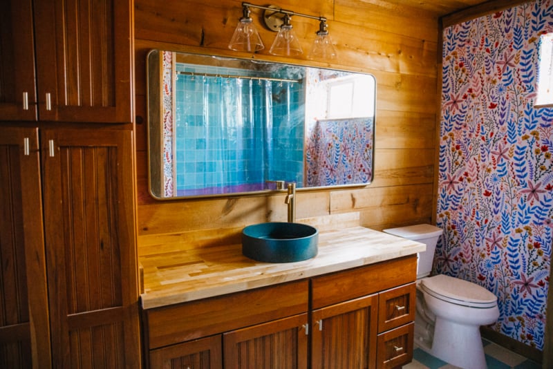
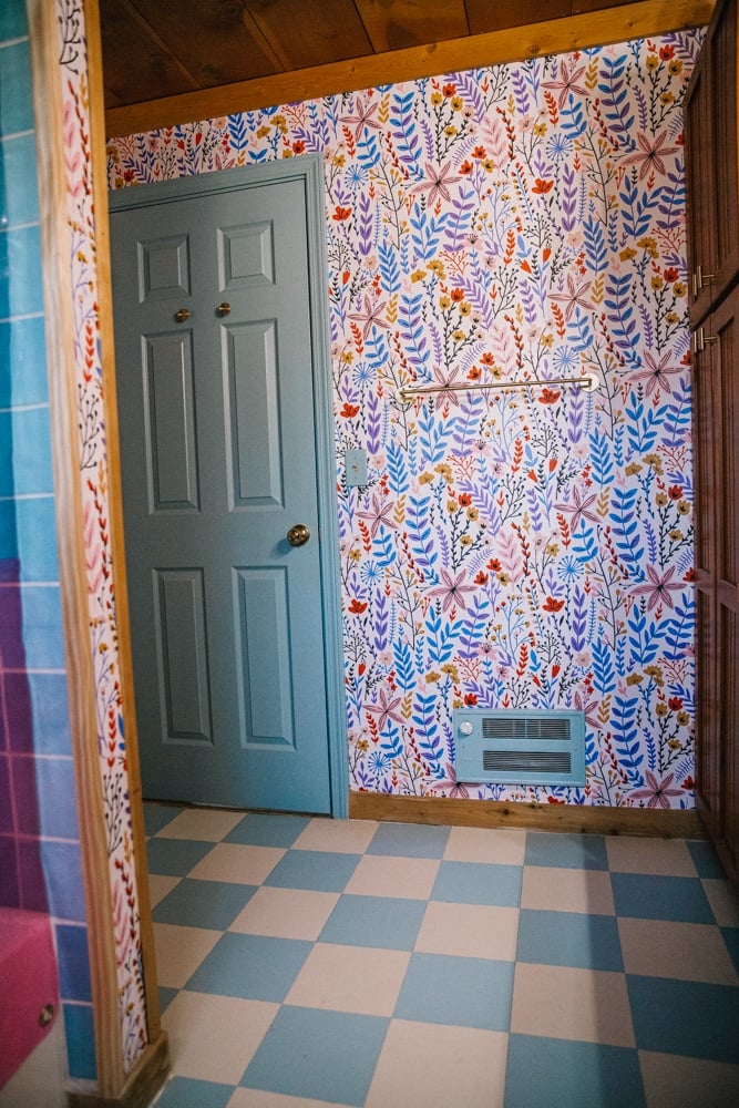
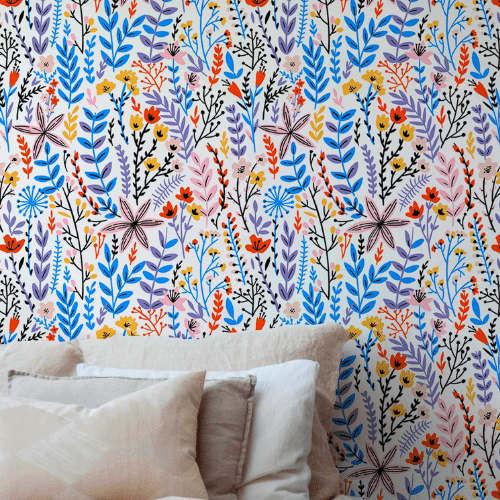
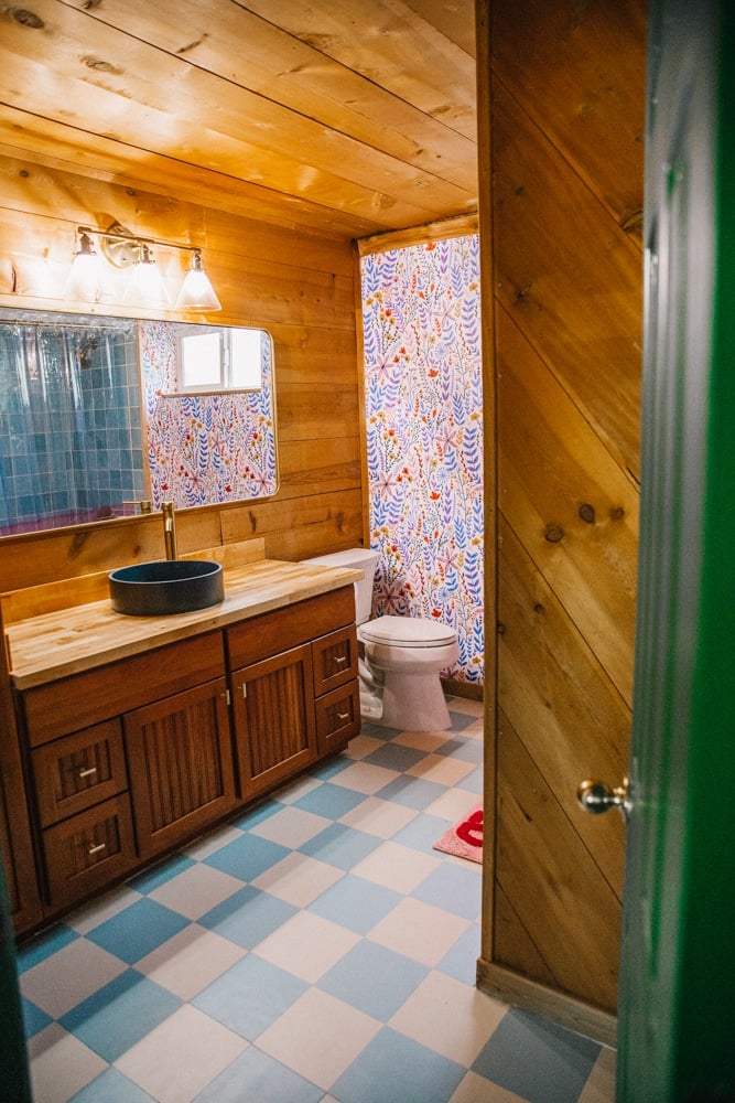
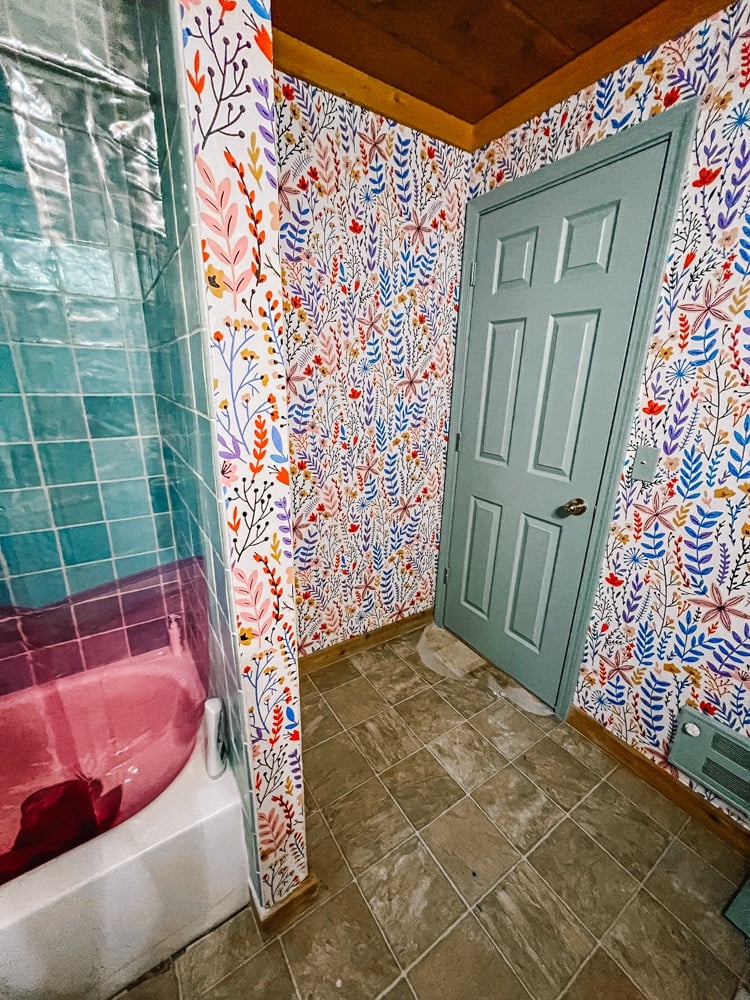
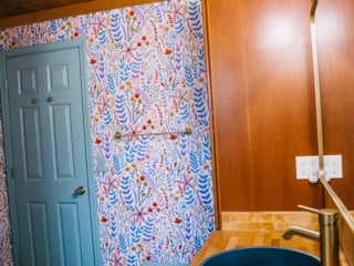
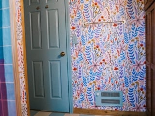
Nothing like a big bold wallpaper for a bathroom. It's peel-and-stick for easy application.
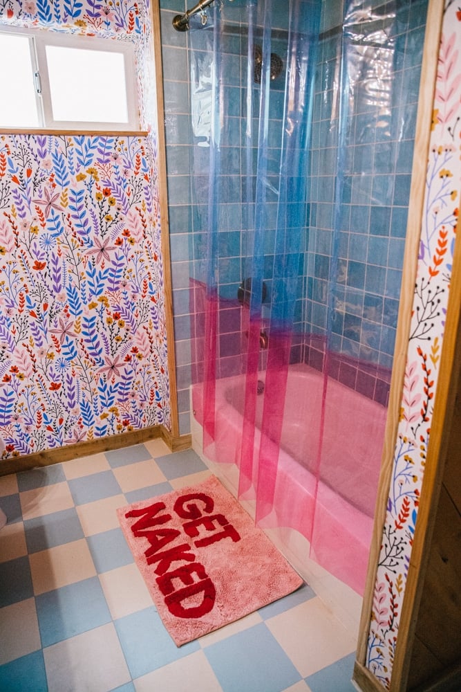
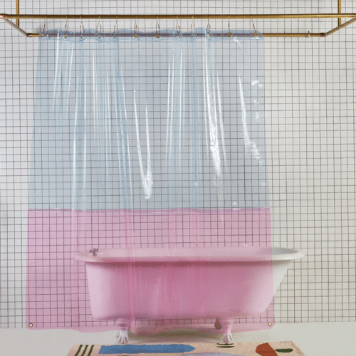
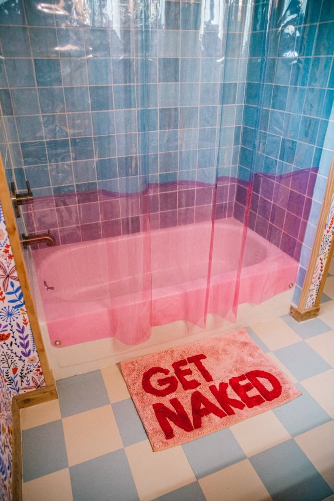
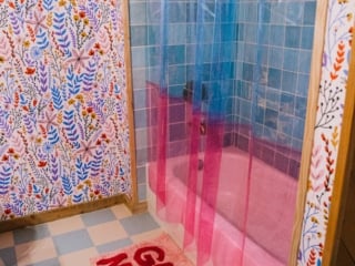
I have one of these sun shower curtains in my apartment so of course I had to add one to the cabin! They're so fun.
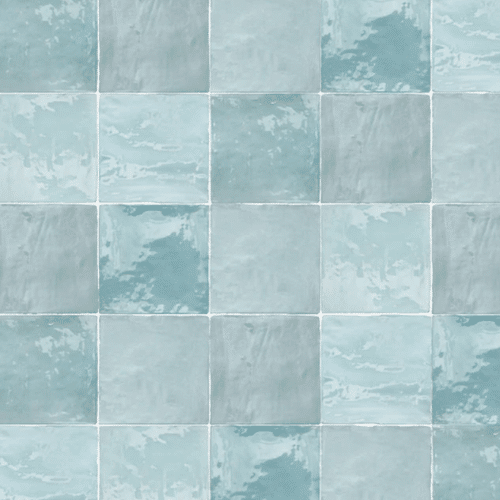
The beautiful blue tile in the downstairs bathroom. It's more blue irl!
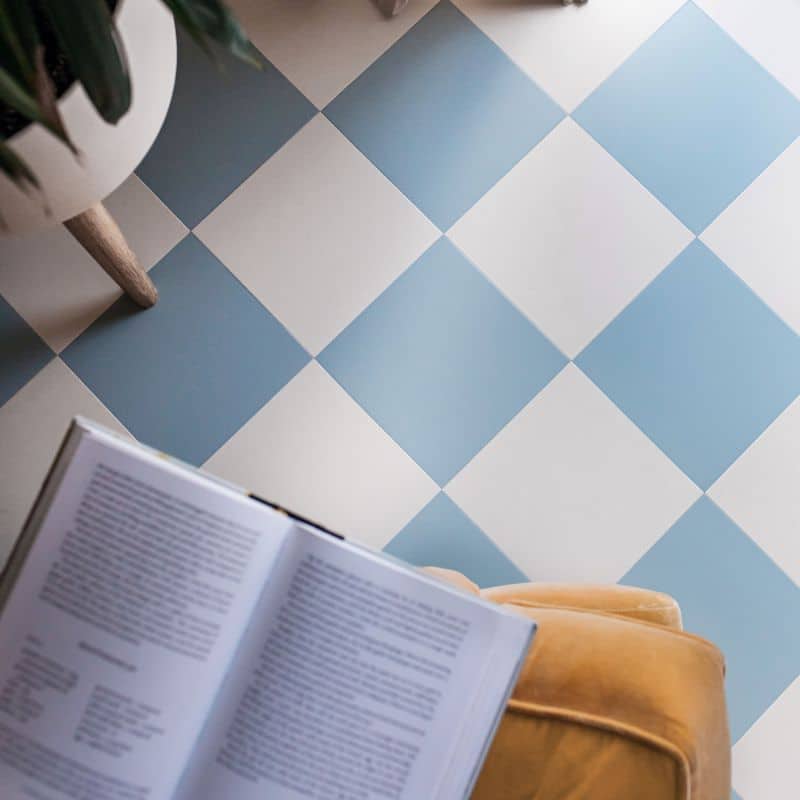
Easy to clean, slip resistant & high quality luxury vinyl tiles for bathrooms, kitchens, etc
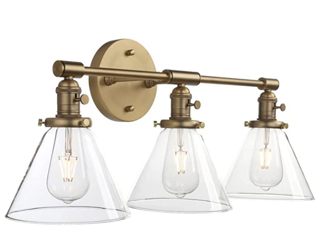
An affordable 3 light wall light with slight nordic vibes due to the triangle glass fixtures. In our bathrooms & kitchen.
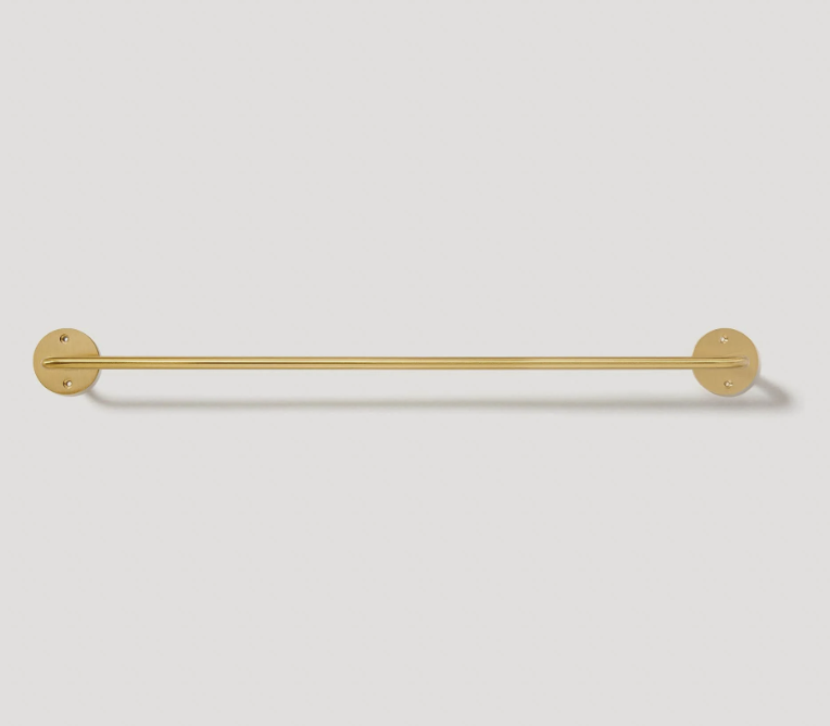
Plank Hardware's beautiful towel rack for both bathrooms. Matches our cabinet pulls!
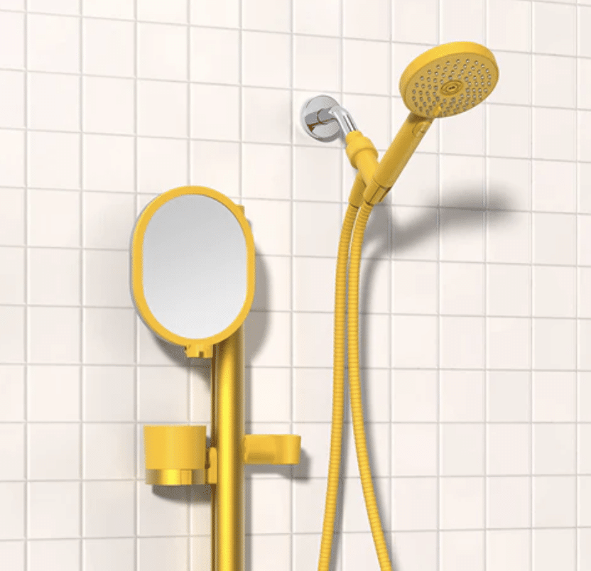
Sproos makes fun, colorful showerheads that are super functional AND totally renter-friendly! We have this in the upstairs bathroom. Use code KARA10 for a discount.
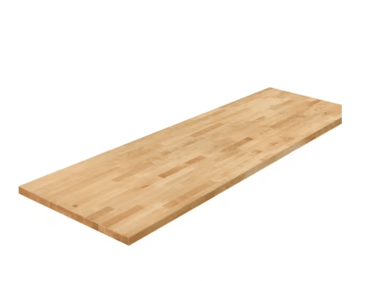
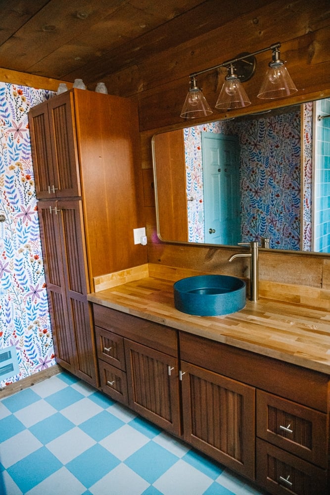
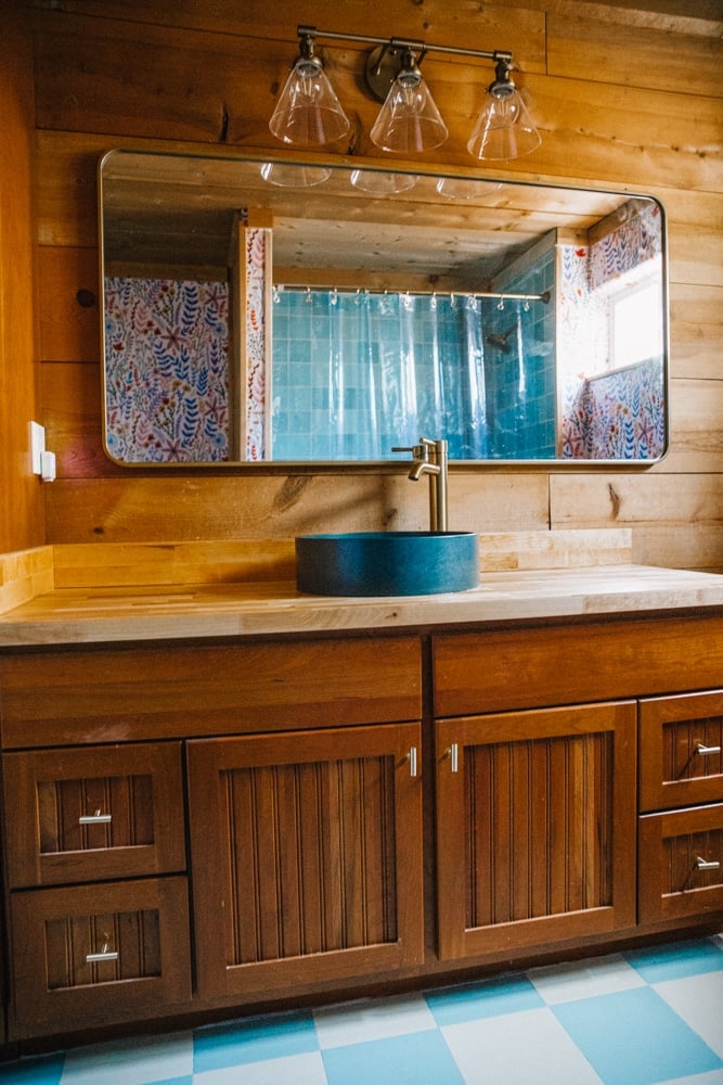
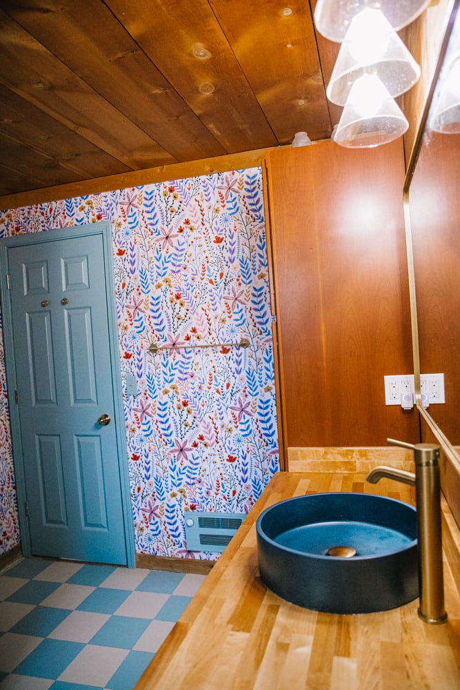
This is a super beautiful and affordable butcher block counter, perfect for bathrooms!
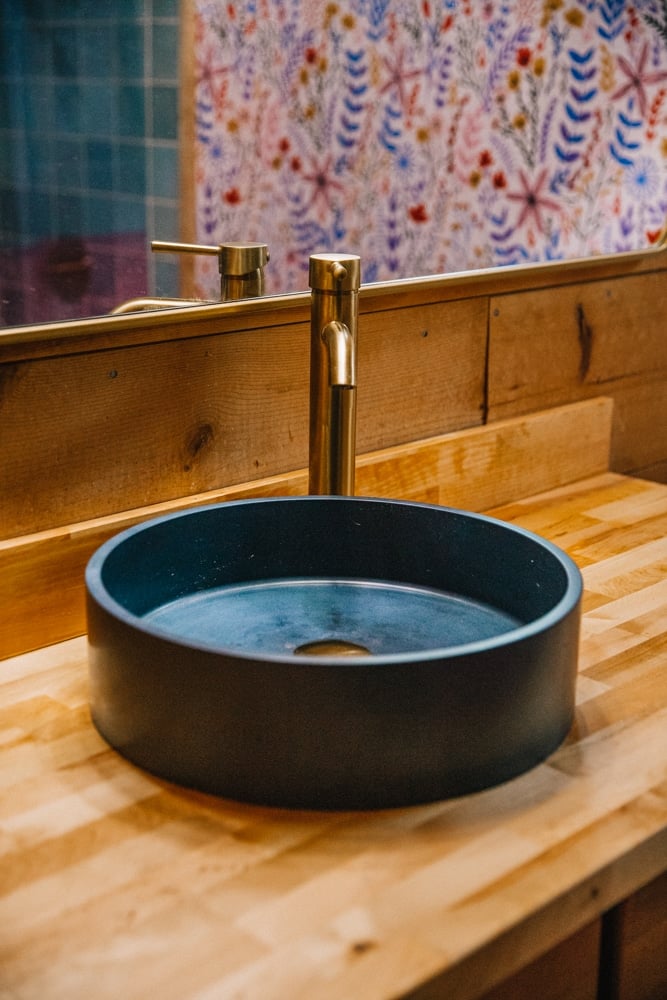
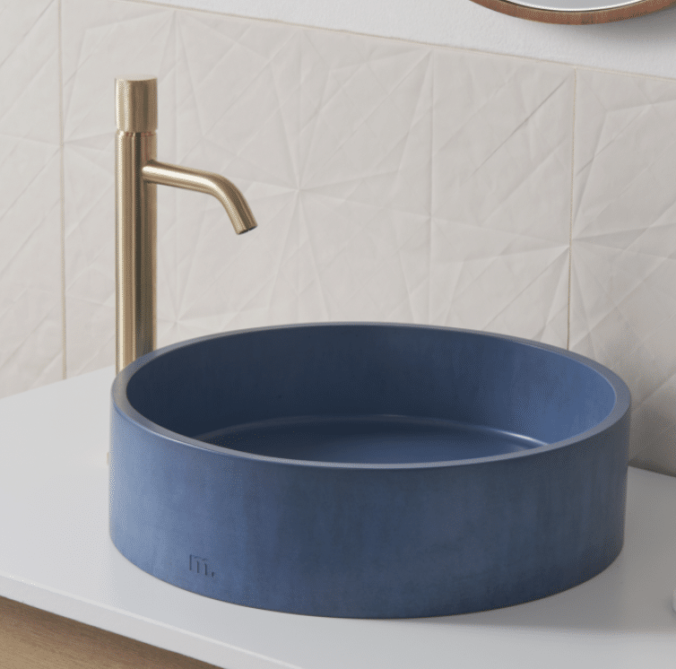
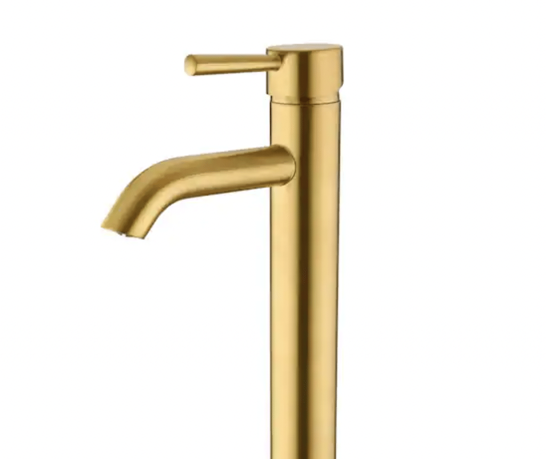
An incredibly sleek and functional bathroom sink. Pairs well with a Mudd Concrete sink!
Step One: Renovating The Bathtub
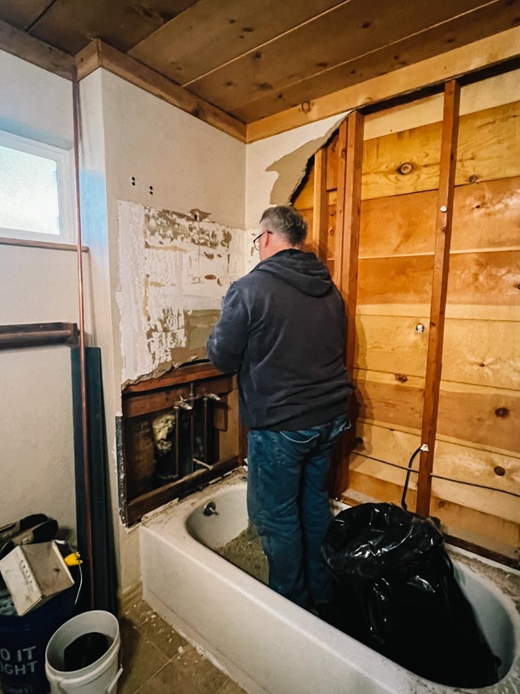
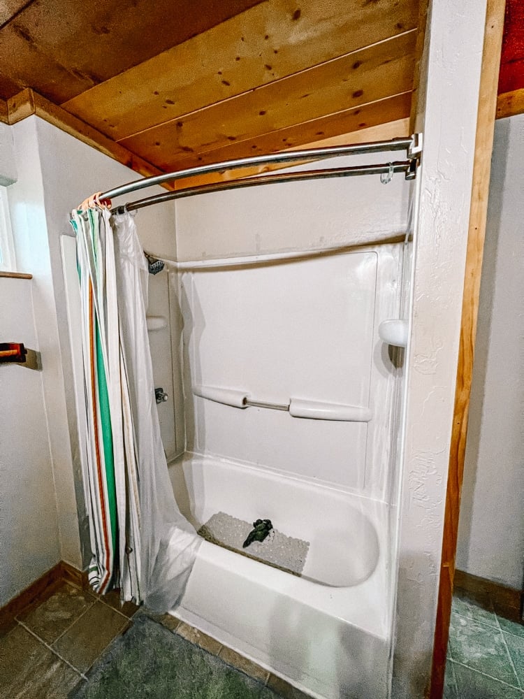
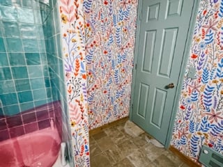
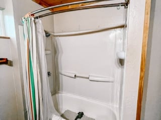
We started this renovation back in February when our lovely contractor, Tom, started work on the bathtub. It came with an old liner that was dingy and the caulking lining it was melting.
Yes – melting!! You could wipe it right off, which is not something I knew caulk could do. The showerhead was also pretty old and kinda gross, so the first thing we did was remodel the area.
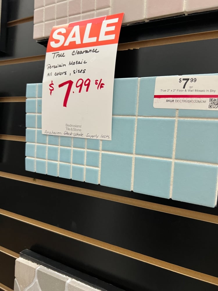
Let me tell you – finding affordable tile in a color that isn’t white or grey is really hard. Almost impossible. Our contractor had a surprise availability and we had about 1.5 weeks to source and deliver all the tile we needed for the project.
Robin and I literally drove all around the foothills trying to find the right tile. We eventually found this Flash Light Blue Tile at a local store in Sonora, California that I’m pretty happy with.
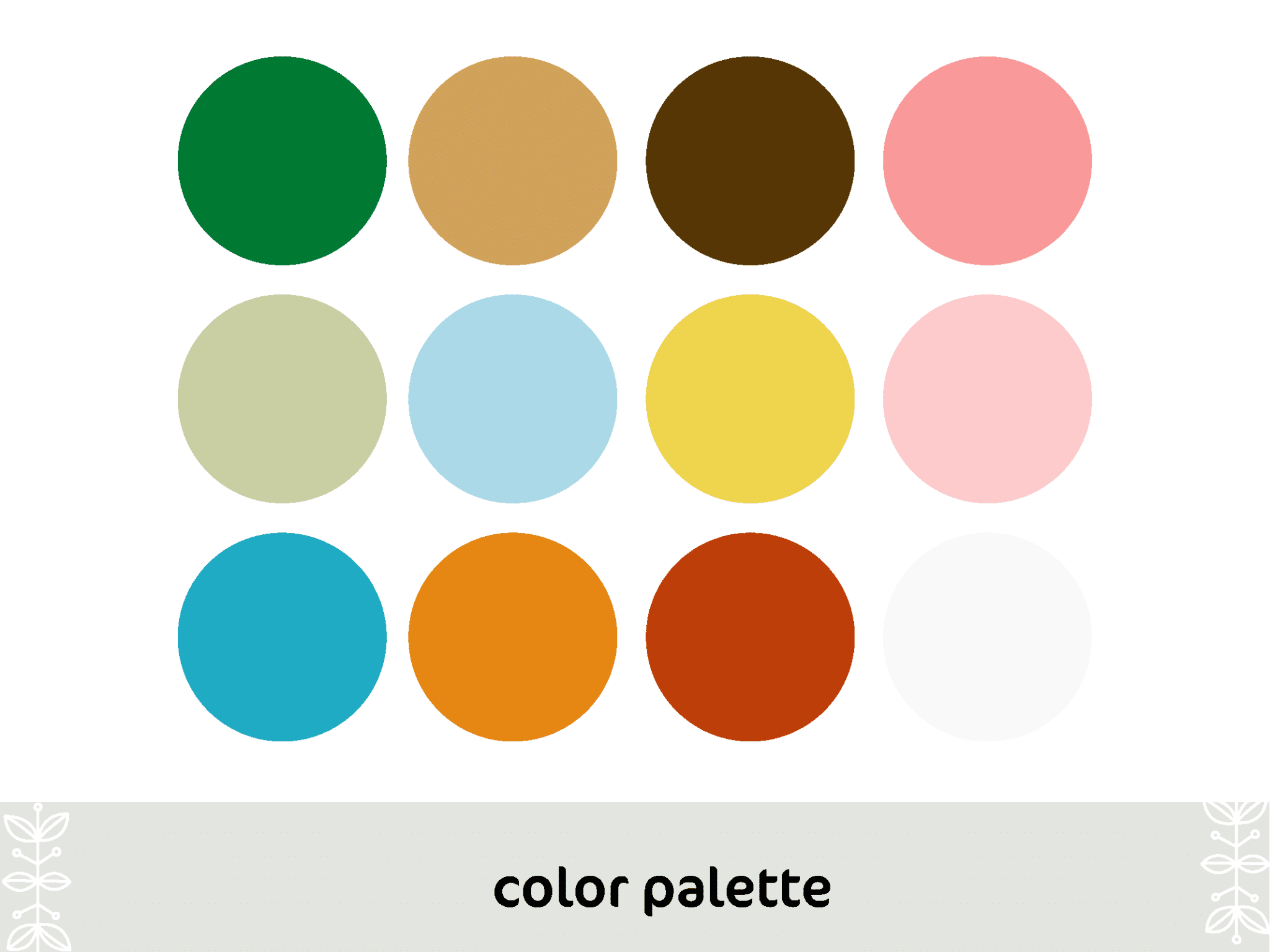
To help make sure the cabin design makes sense room to room, before we started renovating I made a cabin color palette to constantly reference. Since I’m anti-white paint (and this includes tile) I knew the color we had to use for the bathroom had to be one in the color palette.
Since green and pink were already being used in the kitchen, I decided the bathroom should have a blue theme!
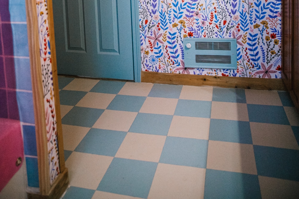
And since our cabin is old and has an eclectic theme, I wanted to lean into the retro vibe a little bit. The tile unfortunately wasn’t built to be flooring tile (apparently there’s a difference??) but I lucked out extremely and found Harvey Maria, a brand that makes checkered luxury vinyl floor tiles that almost nearly matched the blue in the shower!!
Step Two: Adding Flooring
I had a LOT of confidence going into putting down the LVT and it absolutely humbled me. It’s a lot harder than it looks, mainly since the floor glue oozes out from under the tiles and gets really messy. It’s still somehow oozing out in the cracks and I feel like I’m constantly cleaning up the tiles right now until it fully sets and dries.
BUT, it was a million times easier and cheaper than ripping out the old flooring and doing the whole grout thing.
I just glued our checkered tiles right on top of the flooring and this process took a few days as I had to let some areas of the floor dry so later I could come and work on top of them.
They are absolutely not perfect at all (hey, it was my first time using these!) but I’m really pleased with how they look. I think they match the blue shower tiles very well and add to that retro feeling we’re building in the cabin.
Step Three: Wallpaper Time!
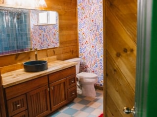
The real gem of our renovation is our Scandi floral wallpaper. I hunted for AGES for the perfect wallpaper for this room and tested probably at least 20 samples.
Our eclectic cabin theme has an undertone of Nordic, inspired by our time living in Copenhagen. When I saw that this floral wallpaper looked a lot like Scandi flower designs AND had mostly just the colors in our cabin palette I knew it would be perfect!
As I said before, I firmly believe bathrooms are the best place to go a little wild with patterns and color. Think about restaurant and bar bathrooms, ones that have bold wallpaper or paintings on the ceiling. Those spaces are always so memorable, so I wanted to create a memorable bathroom here.
Full disclosure, we bought peel-and-stick wallpaper when I should have bought the pasted. I used Peel and Stick in my San Francisco apartment and I was terrified of using pasted wallpaper. It just sounded a lot harder!
And then we put pasted wallpaper in the kitchen and realized it’s 10000% easier than peel and stick. But you live and learn!
Anyways, the second we got this wallpaper up the whole vibe of the room changed in all the best ways. It’s also one of the top things people compliment when they visit the cabin!
Step Four: Installing A Beautiful Mudd Concrete Sink
The bathroom felt good, but I knew it could be better. Enter: Mudd Concrete sinks. They make simply the most beautiful basin sinks on the planet.
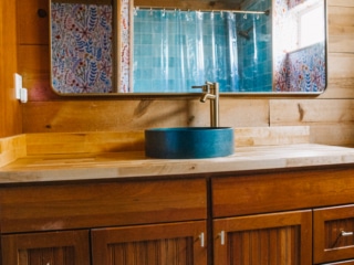
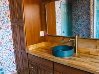
The previous white sink was fineeee I guess, but it wasn’t giving me joy and wasn’t adding anything special to the room. So, I found this butcherblock counter on Home Depot for about $120 and our contractor was able to easily rip out the old sink, cut the block board to size and install our Mudd Sink in a day.
Mudd Concrete sinks come in all sorts of colors – red, pink, green, but I chose a dark blue to vibe with the blue bathroom, but not be too matchy-matchy. It also looks fantastic with the orange hue of the wood (blue and orange are complementary colors after all!)
I’ve never had a basin sink before but I love it. It’s way easier to keep clean than the old built-in sink and it looks wicked cool.
Step Five: Adding Details
Home design is all in the details. The details will turn your home from good to fantastic and tie everything together. When all the big things like the sink and tile were installed, it was time to focus on bringing everything together.
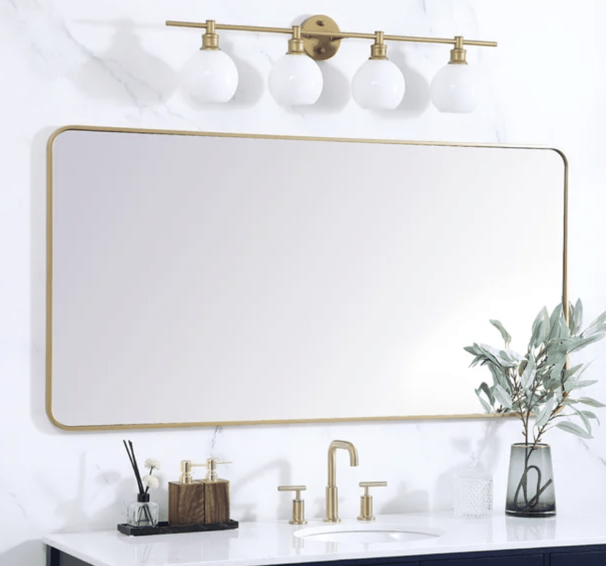
So, the silver light was swapped for a gold one. (In fact, the kitchen and upstairs bathroom all have this gold light to feel cohesive in the cabin!)
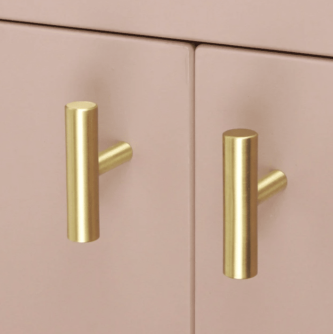
The silver cabinet handles were swapped for sleek gold pulls from Plank Hardware. They’re a rad company that specializes in damn beautiful cabinet hooks, pulls and rods at an affordable price.
We put Plank Hardware in our kitchen and these exact T-Bar pulls are also going in our upstairs bathroom to help visually connect the rooms!
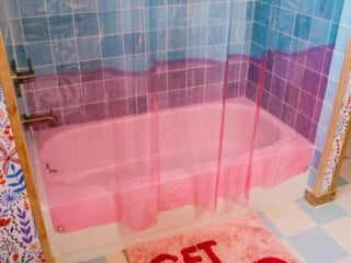
Then, a fun see-through Quiet Town Home shower curtain. I love these shower curtains since they add color to a space but also let in natural light. I use an orange one in my San Francisco studio apartment bathroom!!
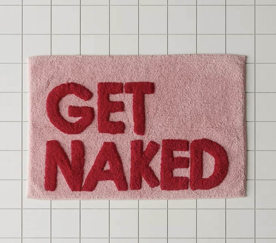
Then, a fun bath mat from Urban Outfitters, an oversized brass mirror so everyone can get ready at once, a gold door knob to match the metal theme, and a final Plank Hardware towel rod to complete the space.
I still have to install that gold toilet paper holder but otherwise, she’s all done!! It now has such a different, wonderful, happy feeling compared to the before photos.
If you want to fine more home decor inspo, follow the cabin’s Instagram account @whimsy_homes or TikTok @whimsyhomes






1 comment
off8ob