EKK!! The day is here! Whimsy Soul just got a facelift with a BRAND NEW logo and blog design! *Pops bottle of champagne to celebrate*
As the Whimsy Soul brand evolves, so does the importance of banding and a site that evolves with our needs but also the needs of our readers. With our new site, it’s now easier than ever for you to find the inspiration and information you need, not matter when it was published. I’m also thrilled with our new branding which I think better reflects what Whimsy Soul is all about!
If you’re curious, keep reading to learn more about all the behind the scenes things that have been going on the past few months with this brand refresh! Or, explore all the new website features on your own. I think you’ll like them!
Are you subscribed to our newsletter? We’re relaunching it in a few weeks. Sign up here!
This is actually the 3rd Whimsy Soul logo. When I first launched the blog back in 2015, I had a very terrible logo with an owl for a few months. It’s so bad, I’m not reposting it here. I made a new logo a few months in and that was the branding we had for close to four years. FOUR YEARS! That’s a long time.
When I told friends and family we were doing a brand refresh, so many people told me “Why, I like your blog. Your logo is fine!” But I never want to settle for “just fine.” Robin and I both felt that it was time for our branding to grow up. We also have a lot of big plans in store for the future and we felt like the old site and logo weren’t the right platforms to build upon. Whimsy Soul 3.0 is just what we needed as the foundation!
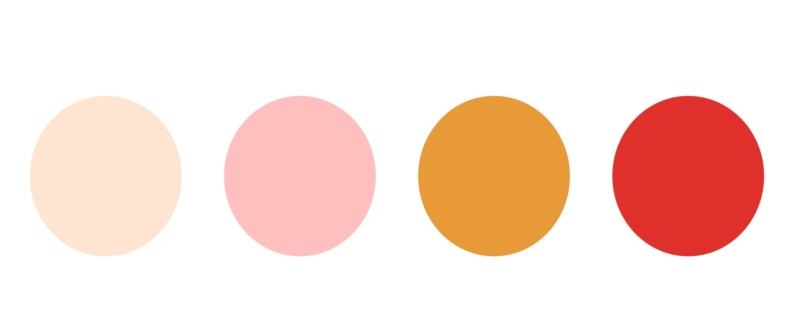
Our very talented friend and neighbor Tommi Sharp handled our new branding. Robin and I couldn’t be happier with what she came up with. As you can see, we have not only a brand new logo, but new fonts and new colors. Goodbye black and pale blush! Hello yellow, pink, red! I think these colors breath some life into the Whimsy Soul blog and are more fun to create with!
I also have to give a big thank you to the team at Performance Foundry for answering my 1923849234 coding questions and helping us get off the ground with the new site. If you are a blogger or small business looking for an amazing hosting service, these guys are the real deal!
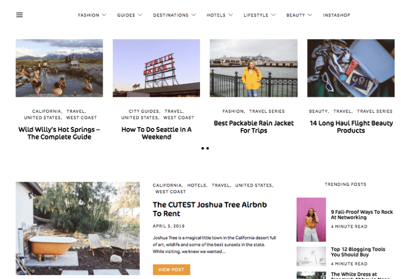
As you can see, our entire blog site totally changed, and for the better. I think it’s now 100% easier to find a blog post, especially older ones. I get a lot of DMs from you guys asking about old places I have visited and if I can send you the blog post link. I, of course, am always happy to do this, but the new menu and sorting features on our new site will make it much easier for you guys to discover the content you are looking for! We put reader’s needs first when redesigning our blog and I’m really thrilled with how much easier it will be for you guys to use.
We also are re-structuring our city guides, travel guides and hotel blog posts so the information is easier to consume. We’ll be slowly rolling those changes out over the next month or so, and I’m excited to get your feedback on the new layouts! We’re also adding Spotify playlists and Geocaching maps to some of our past guides, just for fun! Things are looking very different over here!
Lastly, we’re now introducing YouTube videos into blog posts! Moving forward, our new YouTube videos will also be posted on Whimsy Soul as a blog post. I know a lot of you don’t have YouTube accounts so you aren’t getting alerts on our new videos. Now, you don’t have to go checking yet another channel to see if there’s new content! You can always find video posts under the “Lifestyle” tab. Check out my Joshua Tree Vlog post here!
(Are you subscribed to our newsletter? We’re relaunching it in a few weeks. Sign up here!)
I hope you guys love our new look as much as we do! I’d love to hear your feedback. Also, as you’re exploring the new site, please let me know if you find anything funky going on. It was just Robin and I sorting through 4+ years of blog posts, so we may have missed things here and there. Let me know if you find any bugs!!
Here’s to fun things in store….
-Kara


