If you are trying to grow our Instagram following, I’m sure you’ve been told many times that your Instagram feed should have a “cohesive look.” When I first started blogging @thewhimsysoul, my photo editing was alllll over the place.
Some were bright and colorful, others were muted and cool. But, for the past two or so years, I’ve really honed into my look and Instagram editing style. SO, I’m finally sharing with you all how I edit my Instagram photos – step by step so you can hopefully learn some tips and tricks to use yourself!
>> Got a question about editing images that you need answered quickly? DM me on Instagram @thewhimsysoul and I’ll be happy to help!
Having a consistent look to your Instagram feed is so so important in establishing a brand and a loyal follower base. The goal is for anyone to see your photo (Even if it doesn’t have your face in it) and know that you took it.
That’s why it’s important to find your aesthetic and stick to the same editing style! You don’t have to use the same one preset each time, but you should stick to 2-3, tops.
How I Edit My Instagram Photos in Lightroom
I used Lightroom to edit 99% of my photos. Call me old school (or just old) but I really hate editing apps and editing photos on my iPhone. I just feel like I have way more control over photos when I edit on a computer vs a phone. Plus, I find it’s faster and loading time is cut down.
- Curious what camera I use? I share all my camera gear in this post!
Editing photos in Lightroom on Desktop is actually pretty easy. It may look intimidating but Lightroom allows much more control than a photo editor app on your phone and you can load tons of presets (aka filters) in the program, so you don’t have to rely on Instagram filters.
It takes me about 5-15 minutes to edit all the photos from a shoot. Granted, I used to do professional photography so I’m really fast at editing photos, but that’s really the beauty of editing in Lightroom. It’s so easy to go quickly but still produce well-edited cohesive photos!
I recorded my screen while editing so you can see how I edit my photos! Watch my step by step video below, or bookmark it to watch later!
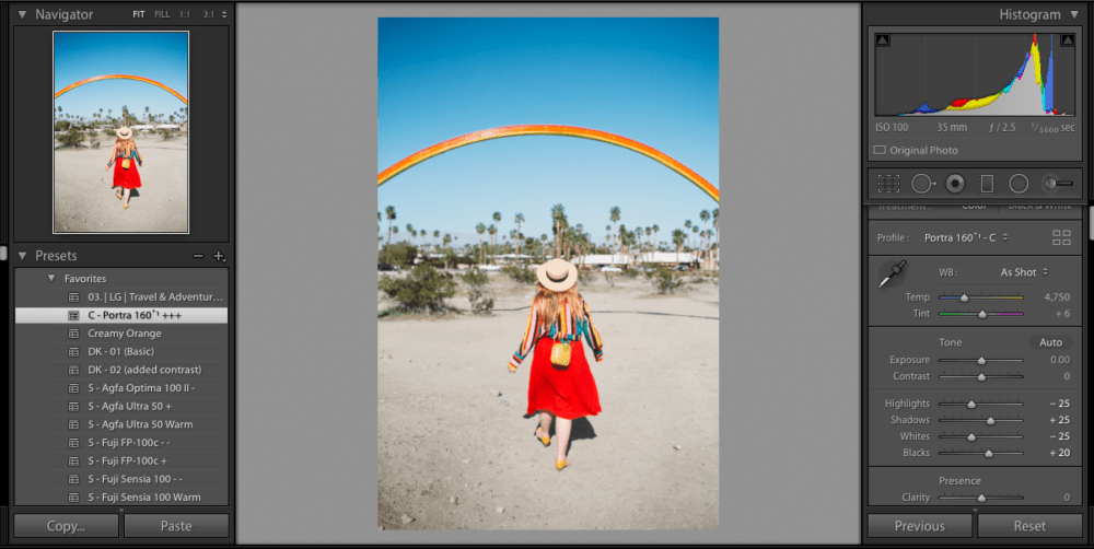
As I mentioned in the video, I mostly use the preset C – Porta 160+1 +++, which is a vsco preset. Sadly, they no longer sell presets for lightroom desktop, but you can still find it (I think) on the VSCO app.
Lightroom is just $9.99 a month (with Photoshop in the bundle!) so it’s very affordable to buy. You can also use your registered email address to gain access to things like Adobe Spark so help you make fun graphics for your feed if you want.
There are so many free presets (aka filters) out there. I recommend you download some free ones and also spend $15-20 on a big bundle like this one from Etsy. Then, import a few different photos in Lightroom and just play around with the different presets.
Figure out what you love and try that preset on a few photos. Once you nail down your style, mission complete! You can confidently edit any of your photos moving forward and know they’ll all have a similar look (even if they are from totally different photoshoots!)
Video Transcript / Step By Step
As promised, here are screenshots and step by step directions from the video! I’m a reader and I love when people slow things down and let me read the steps, so this is for all you who need to learn this way (vs watching a video)
Kara:
Hey there. Looking good! Welcome back to the Whimsy Soul channel. I’m happy to have you here. Today, I’m going to be talking about how I edit my Instagram photos. Has to be one of my most requested videos ever. I get questions all the time about how I edit my Instagram photos. Today I’m going to walk you through editing a couple of photos so you can see exactly how I do it and you can do it yourself.
Here, you guys, I have my computer right here. I edit all of my photos in Lightroom. It is very rare that I am editing something on my phone. If I am, it is something that I snapped on my iPhone, and then I’m editing usually in the VSCO app or sometimes with the presets that is available on an iPhone. Usually though we take photos with the camera that you just saw. By we, I mean my husband Robin. Hey, Robin, do you want to come say hi real quick?
Robin:
How’s it going?
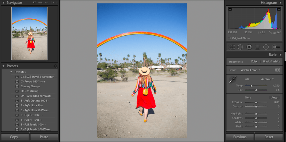
Hey. Robin takes most of the photos for Whimsy Soul, so if you’re ever wondering who’s behind the camera, he is. Lightroom is like the easiest photo editing system. It’s actually super-easy. It looks intimidating but it’s not. I have Lightroom up here, so as you can see, CR2, that means raw. We should with a Canon so that’s Canon raw. I’m going to start with this one, because I like this one a whole bunch.
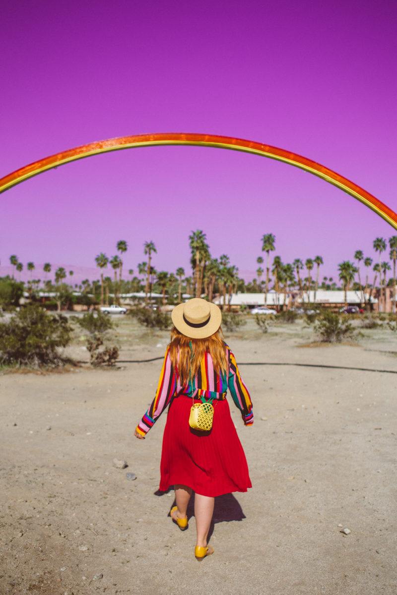
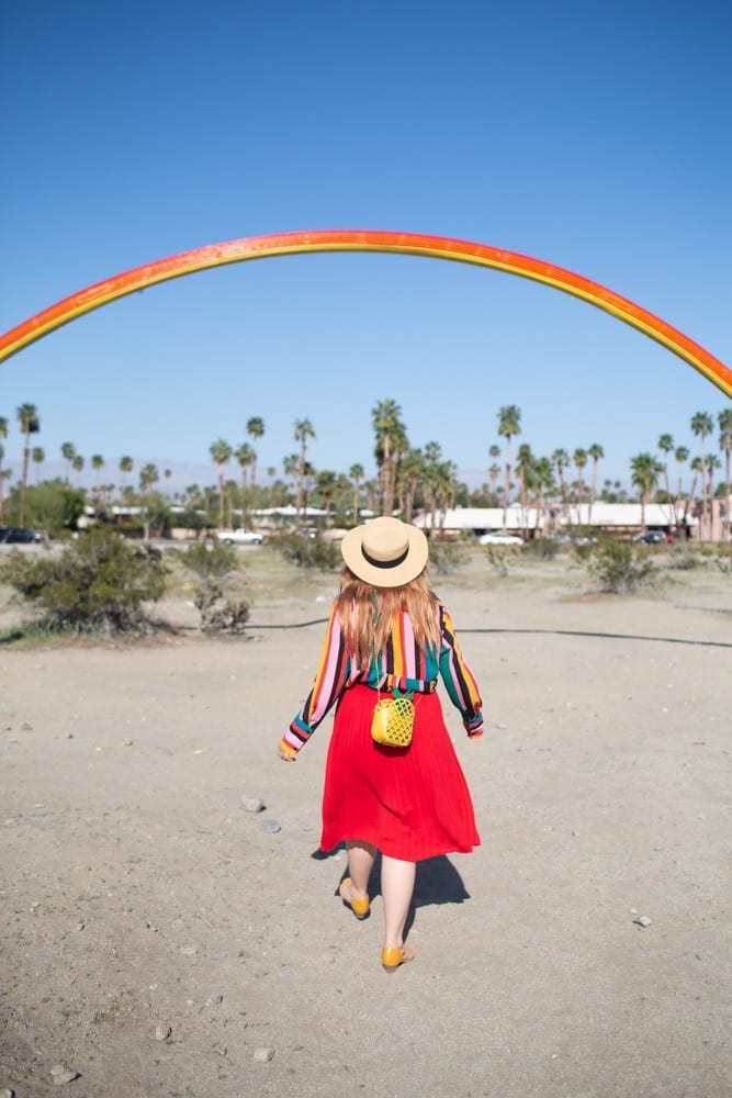
We shot this in Palm Springs earlier this year during the Desert X art installation. As you can see from this photo, we shot it in bright-ass daylight. I think it was like noon, maybe like 1:00 when we’re shooting these. Normally we don’t do that. Normally when we’re taking photos we’re taking photos at sunrise or at golden hour, usually in the shade if we can. We try to avoid direct sunlight when possible, but sometimes we just can’t avoid it. Like here we were on a time crunch and we just couldn’t come back here when the light was softer, so we had to shoot in the bright daylight.
Don’t worry, I’ll show you how I edited around it. This right here is the photo I posted to Instagram a couple of months ago. Same shoot, just a slightly different angle. I’m going to recreate that photo for you. Start here, I have it in the develop mode, and then over here I have presets. I’m like a preset junkie. I collect them. When Creative Market offers presets for free, I download them. I have a bunch I have bought over time. These are all presets I either bought or I got for free.
As you can quickly see as I’m scrolling over, every preset makes your photo look different. It’s usually good practice to have a set collection of presets that you use. I use probably three most often. This just makes sure you have a cohesive grid and a cohesive look, so everything looks branded together.
For I would say like 90% of the photos that we shoot and post, I’m using the c Portra 160+1+++, this one right here. This is a VSCO preset. Unfortunately, I think they stopped selling their Lightroom presets in February of this year. It might not be available on desktop anymore, but it might be available in the app if you want to copy it. I always click the presets first and then I edit the settings later.
As you can tell, it’s way too bright, so let’s see what happens when I make it just a little bit darker. [inaudible 00:03:10]. There we go. I’m going to bump the highlights down too. Already it’s starting to look better. I’m going to bump the shadows up just a little bit and also the whiteness just a little bit. I’m going to bring black down just a little bit as well.
As you can see, this is getting to a pretty good point. Even though we shot this in bright daylight it’s not as glaring and bright anymore. The next thing I usually do is I come down to the presence tab right here. Normally I bump clarity up just a little bit. It gives it that stark sharpness, but for portraits and things like swimsuit photos and underwear shots and stuff like that, I usually bump it down. That makes it a little softer. It’s harder to see on this photo. I’ll show you on other ones.
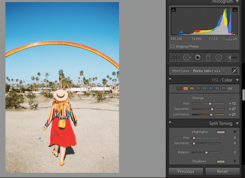
We’re going to make that one up a little bit. I want this to be bright and colorful because it’s a rainbow, so I’m going to up the vibrance a bit. I’m going to up the saturation just a little bit. Now I’m going to come down here. The color board is something that I live in all the time. This is really important. As a ginger, I always really like to make sure that my hair pops in photos and sometimes the color just gets washed out especially in bright light. I really like to hop over to the orange tab right here and bump the saturations up on orange, sometimes making it brighter or darker.
As you can see, this has a huge difference on what your photo’s looking like. Most people are orange skin tones, sometimes yellow depending on your shade of skin. Most of the time you can just hop into the orange and you can really mess with this. If I put it all the way down, you can see right here that it looks like I’m really tan. It actually looks like I am not the race that I actually am. That’s a little too much. It’s a really good hack if you’re trying to look tanner.
I want my hair to pop a little bit more, so I think that is good. Everything’s just jumping out at you. Next we’re going to come down to the split toning here. Again, because I am a warm coned person, I really like to add a little bit of warmth to all of our photos just to have that subtle warm feeling. Some people really like an undertone of cool. I really like the undertone of warm. I’ll just put something in orange and then drop the saturation down to maybe 14%, just something super-subtle, just like a little bit of warmth there.
Now, this is looking pretty good. I’m going to sharpen this up a little bit. As you can notice from the other photo I posted, the sky was pink. I will say normally I don’t heavily Photoshop images. What you see is what you get. I don’t Photoshop anything out. I don’t airbrush my skin. I don’t make backgrounds closer so it looks like I’m somewhere different. I really like to play with the colors and the brightness of a photo, but it kind of stops there.
Just so you know, almost everything on my feed is something that you could go and easily recreate with your own camera. There’s nothing special to it. Well, you know like some influencers, there’s some influencers I follow who have these beautiful images, like travel influencers especially, and then I’ll go to that spot and I realize, oh, they sliced two images together and they brought that background so it looks closer and more impressive. I feel like that’s cheating. I don’t like it. It just makes everyone feel let down when they go to that place and they realize that they can’t get that same photo.
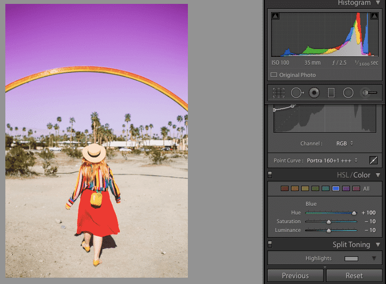
It’s super-misleading in my opinion, and I also really don’t like when people airbrush themselves or use too much Facetune. I don’t know, it’s just my thought there. That being said, my whole little hook here is sometimes I do like to have fun with the colors. As you can see, I went and I turned the sky pink. How I did this is I went to the little blue tab here. Then I just dragged it on over on that color scale. I could make it teal if I want. I can make it more blue, a more muted blue, or I could make it pink like that.
If you wanted to make it brighter, you just have to make the blue side brighter like that, or you can make it darker. I’m going to just leave it right here. That is strictly because this was this fun Palm Springs desert art installation, so I really just wanted to play up the rainbows. I don’t usually do that to the sky for most of the photos.
There we have it, this is looking pretty good. I’m just going to quickly crop it so it fits into an Instagram, and there we go. That is how I edit that photo. It’s super-quick. Now if you’re wondering, “I took 20 shots I really like of a spot. How do I do that?” You’re going to go back to your library. You’re going to click photo, develop settings, copy settings, boom, and now click on the photos that you want, and the same thing, develop settings, paste settings.
Now, that copied over all the settings that I just did, so it saves me a ton of time in editing. You can even set it so it takes the crop too if you don’t even want to worry about cropping. This one actually looks pretty good. Sometimes I have to go through and make a couple of little edits, because the individual photos are different. This is looking pretty good. It might be a little too yellow, so I’m just going to drop down a little the yellow just a bit and make it a little brighter. Other than that, I think it’s pretty good.
Let’s edit another one. It’s kind of like the same deal. I am actually going to start again with that same preset that I used, because that’s the one that I use most of the time. Let’s say I didn’t want that. You can hover over on Lightroom and you can see how all of these are going to change. The other one that I use frequently is this one. It’s the 100C+ and I also use the 400-, but neither of them look quite right in this one, so I’m going to stick to the Portra. There we go.
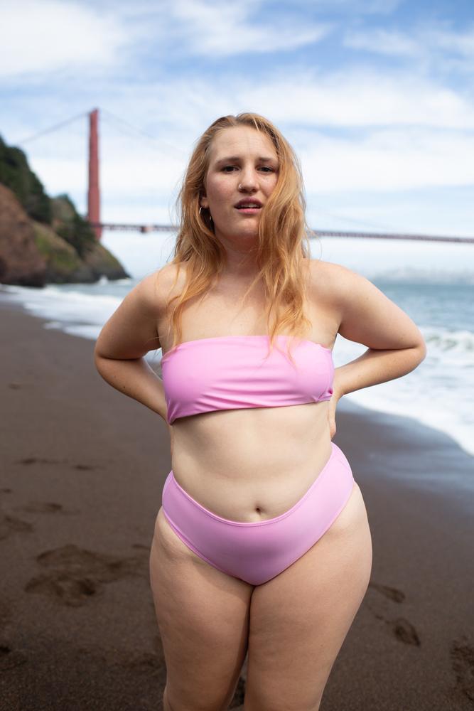
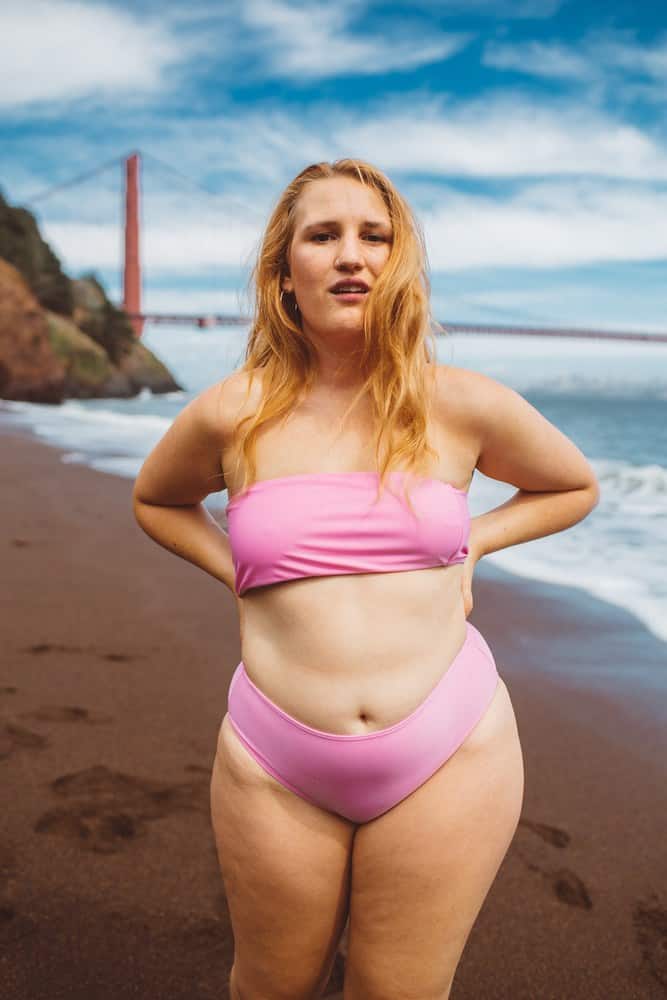
I look way too pale in this. Everything looks kind of weird and washed out. We’re going to go kind of the same thing. I’m going to drop the highlights down on here so the sky comes to life. I am going to go down here on the oranges, and I’m going to add a little bit of saturation, and then I’m going to actually drop it down just a little bit. All of a sudden it looks like I have color on my skin.
I really was tan in this photo. Just sometimes it doesn’t pick up. Looking decent. Going to come down here and I am going to put this as a negative three for clarity just to add that soft little glow. Going to bump up the vibrancy just a little bit. I’m thinking the shadows might need a little more help here. There we go. Overall this is looking okay. I don’t always touch the temperature and tint here, but I’m going to just play with it real quick to see how I feel about it. No.
If you ever make a mistake in Lightroom, you can just go control Z, so I’m going to go control Z, control Z. We’re back to where it’s supposed to be. I’m going to come down to that and make it just a little bit warm. I’m going to sharpen that up a bit. I think my face is just a little too dark, so I’m going to add a little bit of exposure there. Not too much, just a little bit. Kind of brighten my face up a bit there.
I also feel like the swimsuit isn’t popping enough, so I’m going to go back down to look at the pink tab here and just add some more saturation there. Because in real life it’s a bright pink swimsuit and it was a foggy day. All the colors were a little bit muted. I’m going to bring that down just a little bit. Now when you look at it, the swimsuit pops. I don’t look like a pale ghost. It’s looking good. The last thing I’m going to do is I’m going to see what happens with the sky.
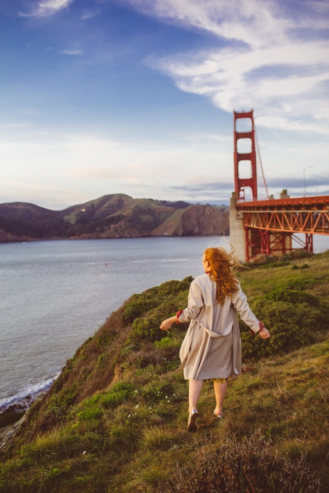
This looks a little too unnatural, but I’m going to make it a little bit darker, because I think it adds to the drama there. I wonder what happens if I mess with the Golden Gate bridge. No, you can’t really see it. We’re looking pretty good there. I think this is pretty good. What do you think?
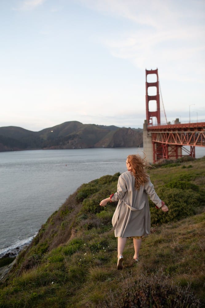
I’m going to crop that just like that. Boom. That looks good. Again, I don’t Photoshop myself. I don’t airbrush myself, so you can see my cellulite and curves here, but I don’t care. I’m putting that up on Instagram anyways. We have another Golden Gate picture. I’m actually because it’s this, because it’s kind of the same location, it’s on the other side of the bridge, I’m going to do that thing real quick where I copy settings, and I’m just going to paste it and I’m going to see what it looks like.
You know, it doesn’t look too bad. Again, that’s what really helps when you stick to your same sort of preset is you can kind of copy your settings over to photos even though they’re taken at different places or different times. Most of the time you do get something that is like 80% done. It saves you a bunch of time.
Now, I’m just going to hop in here. Let me see. I think I want to make the sky a little more saturated. There we go. I’m going to make it a little more dark blue. Then I think I want to make it a little more orangy. I actually want to pump up the greens. Normally I don’t pump the greens, but I really wanted to let nature pop here. Let’s see, I’m going to put just a little bit of exposure on myself so I really pop against there.
Then this is a trick I do adding warmth. I’m going to go over to the brush. Sorry, did that too quickly. I’m going to go over to the brush and then I’m going to toggle down to warmer. This is a really big brush. I’m going to make it smaller, and I’m just going to paint my hair a little bit to bring out my red color a little bit more. Then I think we’re good.
Sometimes I will take that warmer brush and I will paint it over half of the photo to make it feel a little more glowy. I’m not going to do it for this one. Let’s see, I am going to, nope. I don’t even like that. I am going to pump this warm undertone up just a little bit more and then crop it. Boom. These are all the photos that we just edited. As you can see, they’re all basically edited in the same way with some minor differences.
That is it. That is how I edit my photos. It’s pretty simple. I think you can recreate it pretty easily. If you have any questions at all, leave a comment below. Shoot me a DM. I’m more than happy to help you any way that I can. Also, if you are new here, hi. I would love to see you around, so make sure to give me a follow. Leave a comment. I’d love to get to know you a little bit better. Welcome to the Whimsy Soul community.
This is how to edit Instagram photos like a blogger! Instagram photo editing doesn’t have to be scary or cookie-cutter. There are plenty of styles and looks out there, so play around with what you like best and rock that photo style!
I hope this help you learn Lightroom. Have anything to add? Every opinion counts, leave a note below! Got any questions? Leave a comment below or DM me on Instagram @thewhimsysoul and I’ll be happy to help!


1 comment
Interesting. I usually download my pictures from saveinsta, and edit them in photoshop afterward. It seems to work well for me every time especially since I know how to use photoshop. Thanks for sharing!